![[CSS] border, background, text](https://img1.daumcdn.net/thumb/R750x0/?scode=mtistory2&fname=https%3A%2F%2Fblog.kakaocdn.net%2Fdna%2FbxYCKQ%2FbtrkZK4e5ba%2FAAAAAAAAAAAAAAAAAAAAAFg5KF590_PkaKExE6s728VZmB7U_ppoowg5wJqlIBrt%2Fimg.jpg%3Fcredential%3DyqXZFxpELC7KVnFOS48ylbz2pIh7yKj8%26expires%3D1780239599%26allow_ip%3D%26allow_referer%3D%26signature%3DzgWj%252BLfh6bsqpZ9sXv6Jg3BnOw4%253D)
728x90

1. border
border-radius : 박스의 테두리 선을 둥굴게
box-shadow : 박스의 그림자 지정
border-image : 특정 이미지를 테두리의 배경으로 지정
<!DOCTYPE html>
<html>
<head>
<meta charset="UTF-8">
<title>border</title>

<style type="text/css">

	body{
		font: 30px "궁서";
		color: #333;
		margin: 20px;
	}

	li{
		list-style: none;
		width: 100px;
		height: 70px;
		text-align: center;
		padding-top: 30px;
		float: left;
		border-radius: 50px 50px 50px 50px;
		-webkit-border-radius: 50px 50px 50px 50px;
		-moz-border-radius: 50px 50px 50px 50px;
		-ms-border-radius: 50px 50px 50px 50px;
		-o-border-radius: 50px 50px 50px 50px;
		/*
			-webkit-	: 크롬, 사파리
			-moz-		: 파이어폭스
			-ms-		: 익스플로러
			-o-			: 오페라
		*/
	}
	.c1{background-color: red;}
	.c2{background-color: orange;}
	.c3{background-color: yellow;}
	.c4{background-color: green; color: ghostwhite;}
	.c5{background-color: blue; color: ghostwhite;}
	.c6{background-color: purple; color: ghostwhite;}

</style>

</head>
<body>
	<ul>
		<li class="c1">C</li>
		<li class="c2">I</li>
		<li class="c3">N</li>
		<li class="c4">E</li>
		<li class="c5">K</li>
		<li class="c6">H</li>
	</ul>
</body>
</html>
2. background
gradient : 여러 색을 원형이나 선형으로 칠해주는 효과
background-size : 배경 이미지 크기 조절
backgorund-origin : 배경 이미지 테두리 맞춤
multi-background : 배경 이미지 여러 개 지정
background-clip : origin과 비슷
<!DOCTYPE html>
<html>
<head>
<meta charset="UTF-8">
<title>background</title>

<style type="text/css">

	div, p{
		width: 200px;
		height: 200px;
		border: 1px solid red;
	}

	#bg-size{
		background: url("resources/img/img01.png");
		background-size: contain;
	}

	#multi-bg{
		background-image: url("resources/img/img01.png"), url("resources/img/img02.png");
		background-size: container;
	}

	#bg-clip{
		border: 10px dotted black;
		padding: 50px;
		background: blue;
		background-clip: border-box;
	}

</style>

</head>
<body>

	<h1>background-size</h1>
	<div id="bg-size">background-size</div>

	<h1>multi-background</h1>
	<div id="multi-bg">multi-background</div>

	<h1>backgroung-clip</h1>
	<div id="bg-clip">background-clip</div>

</body>
</html>
3. text
text-shadow : 텍스트에 그림자 지정
word-wrap : 자동 줄바꿈
font-face : 웹폰트 설정
<!DOCTYPE html>
<html>
<head>
<meta charset="UTF-8">
<title>background</title>
<style type="text/css">
#txt-shdw{
text-shadow: 1px 2px #ccc;
}
#wrap{
word-wrap: break-word;
}
@font-face{
font-family: "Goyang";
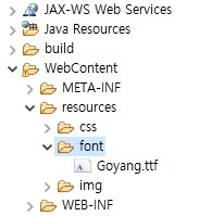
src: url("resources/font/Goyang.ttf") format("truetype");
}
#goyang{
font-family: "Goyang";
font-size: 30pt;
}
</style>
</head>
<body>
<h1>text-shadow</h1>
<div id="txt-shdw">text-shadow</div>
<h1>word-wrap</h1>
<p id="wrap">dkanrjskakdmaeofhrPthrTjqhtpdy.rhdqordjqtdl</p>
<h1>font-face</h1>
<div id="goyang">고양시 고양체 귀엽다.</div>
</body>
</html>
728x90
'Web > CSS' 카테고리의 다른 글
| [CSS] animation(애니메이션), 다단 (0) | 2021.12.16 |
|---|---|
| [CSS] transform (0) | 2021.12.15 |
| [CSS] 레이아웃(layout) - float, clear, display, overflow, position (0) | 2021.12.13 |
| [CSS] 상자(box) (0) | 2021.12.12 |
| [CSS] 배경(background) (0) | 2021.12.11 |